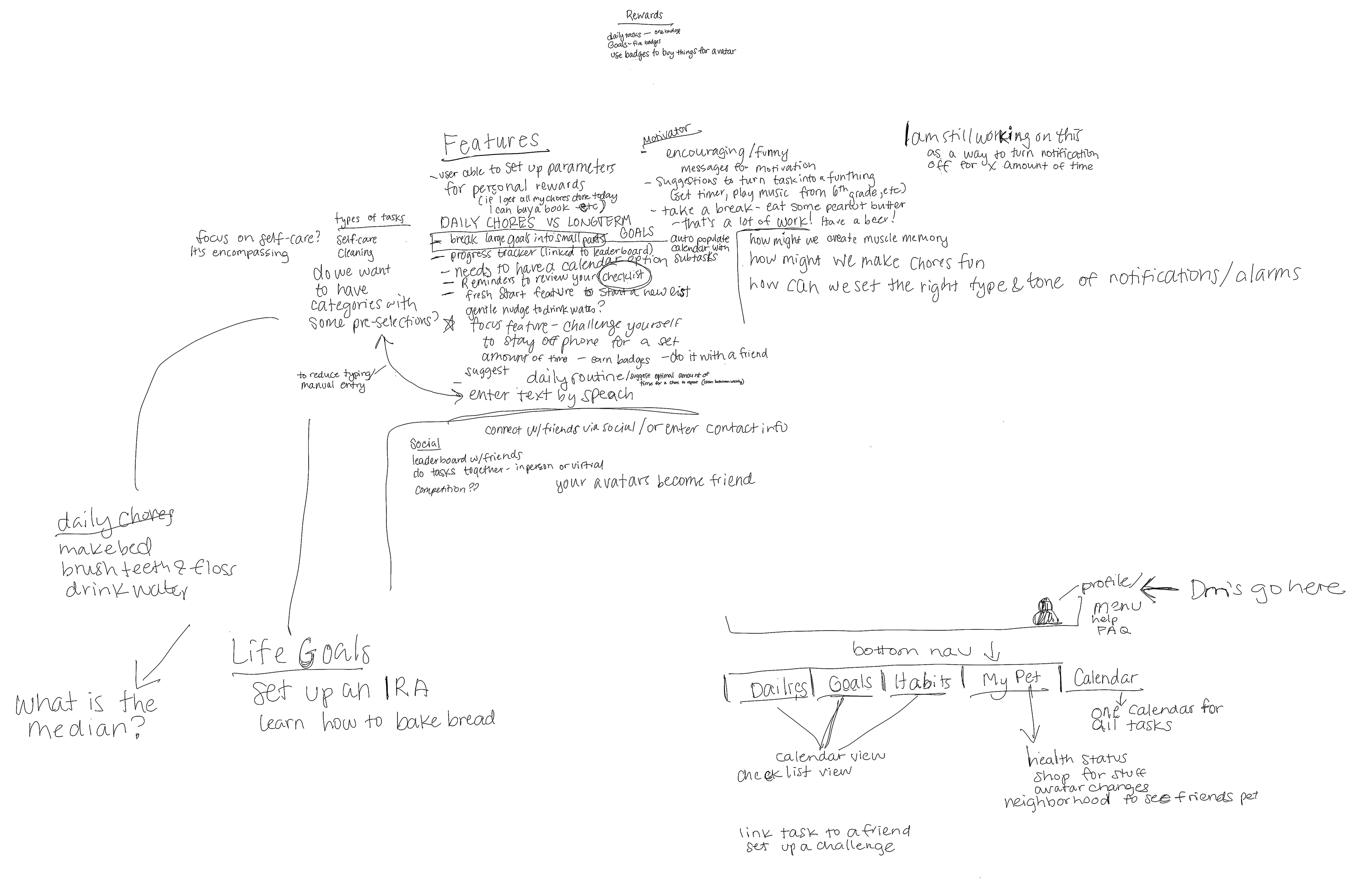
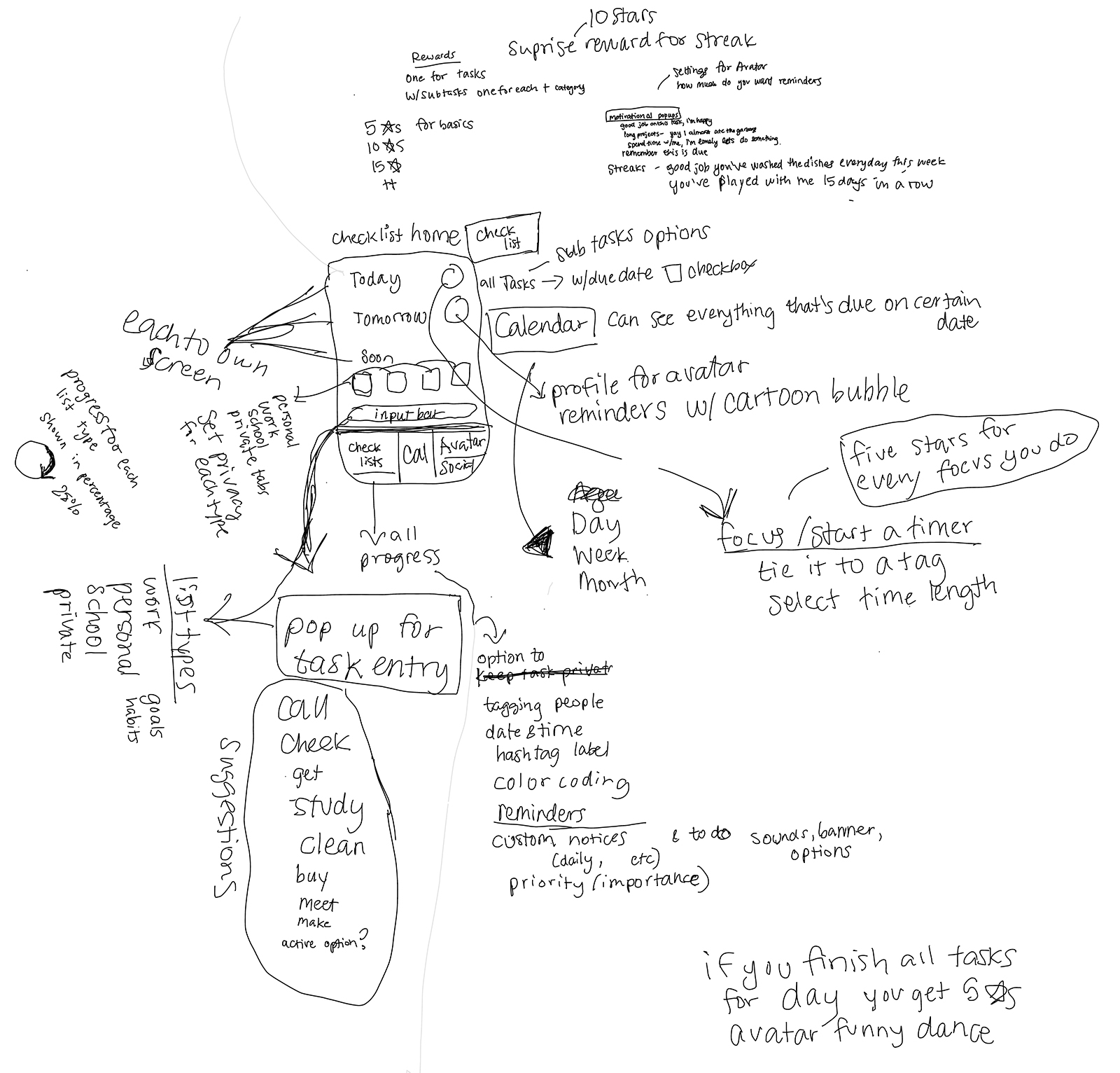
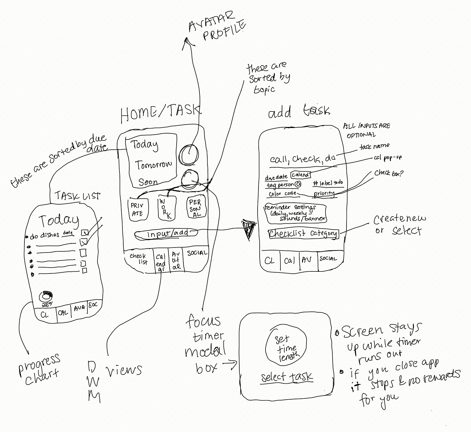
Wireframes
I started with sketching wireframes and brainstorming on how the task section could work.
My teammates focused on the avatar, stats, and how other features could be accessed.
Low-fidelity Prototyping, Round 1
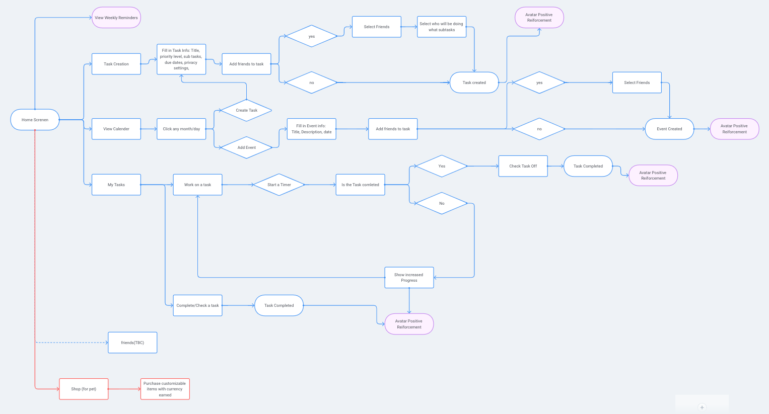
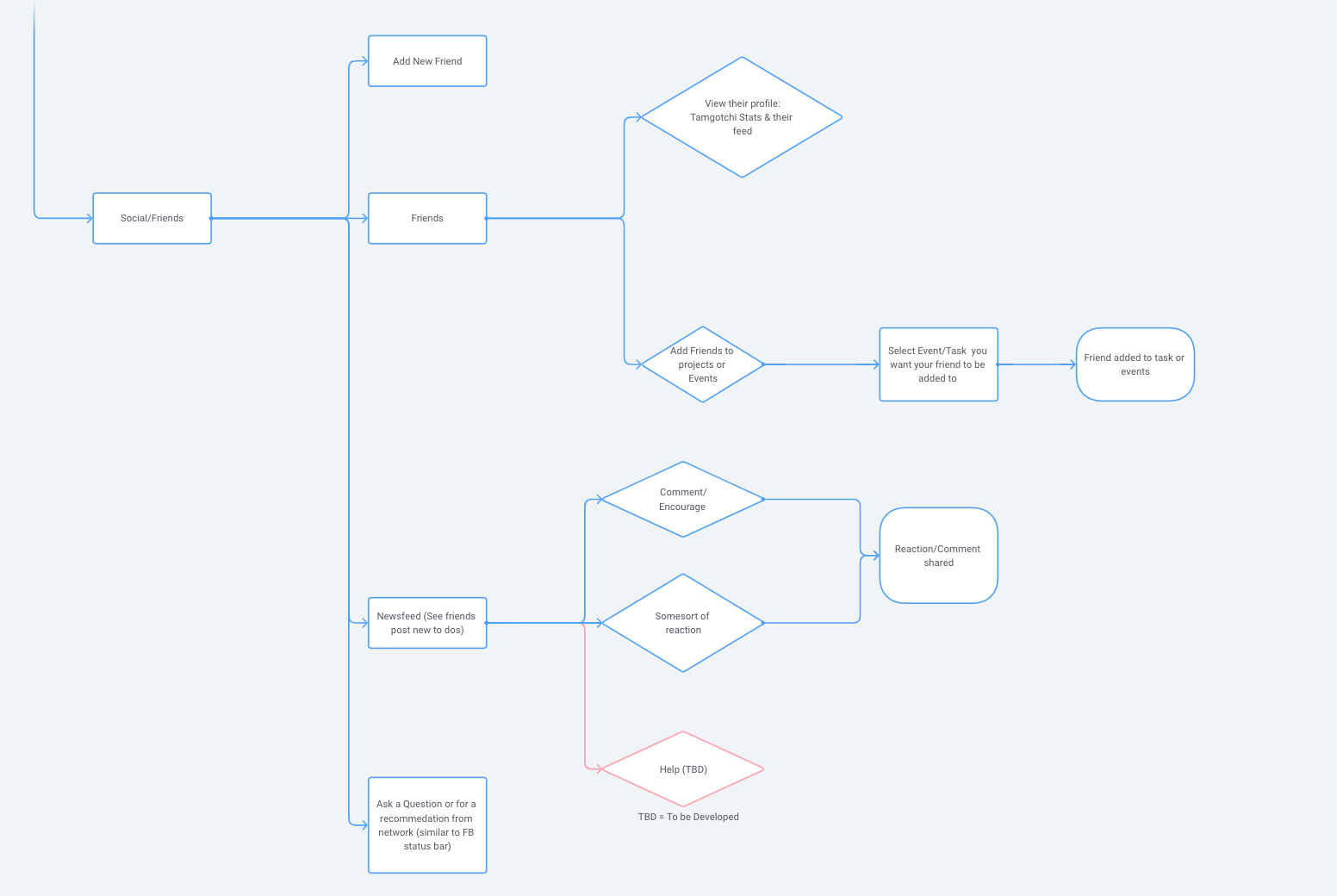
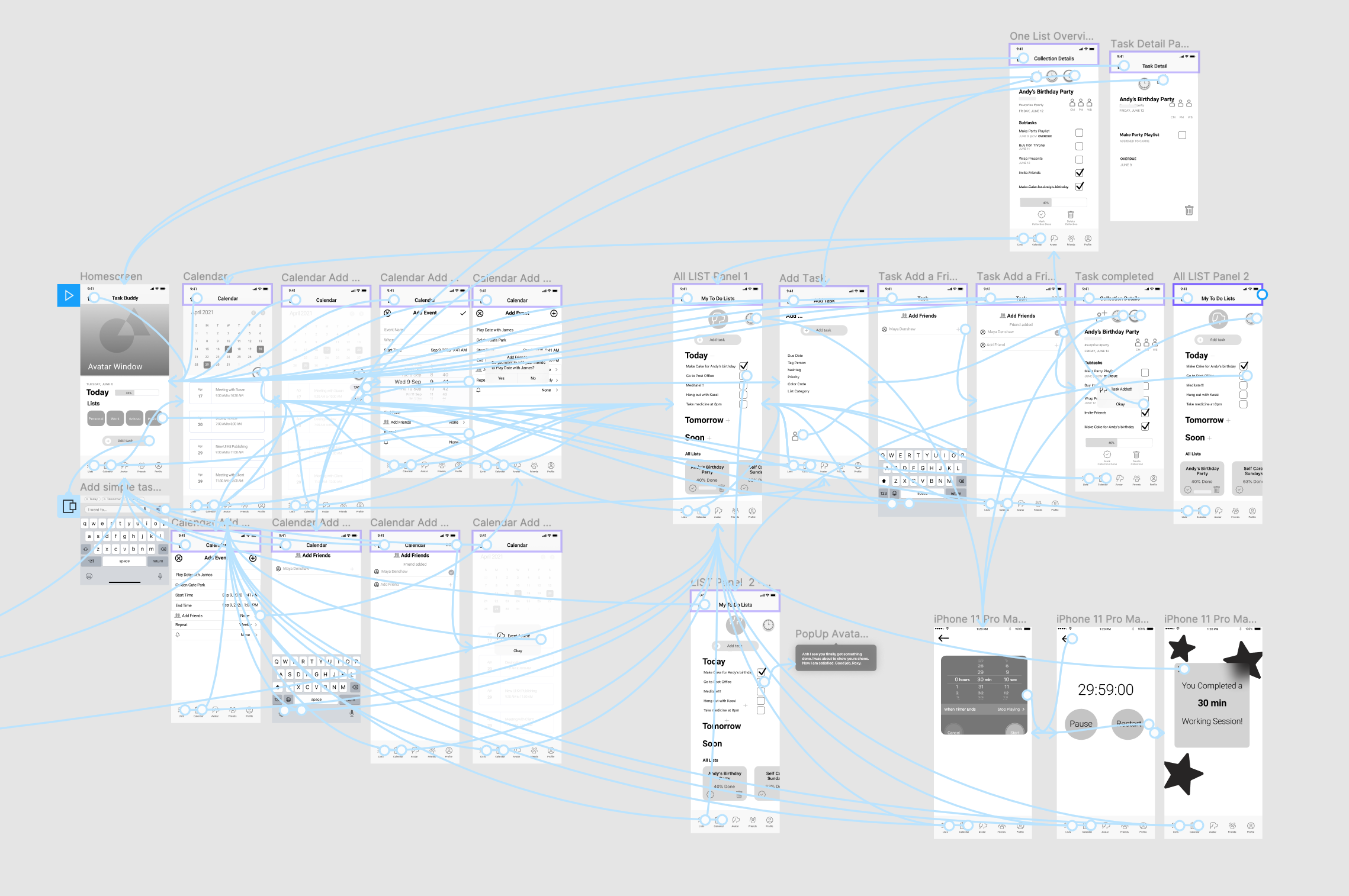
 Prototype Connections in Figma
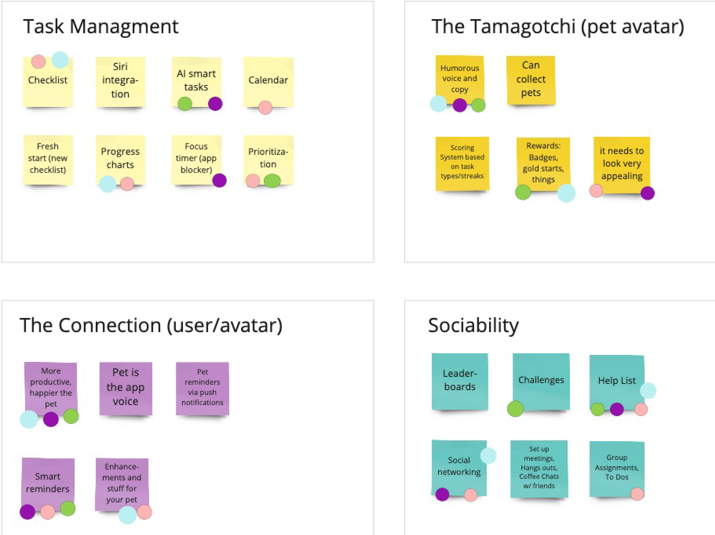
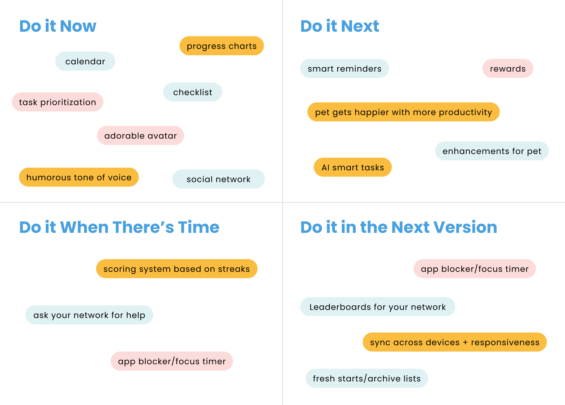
In our first draft we prioritized clear labeling and a simple user interface. We focused on task management,
list organization, task timer, progress tracking and a calendar.
Testing, Round 1
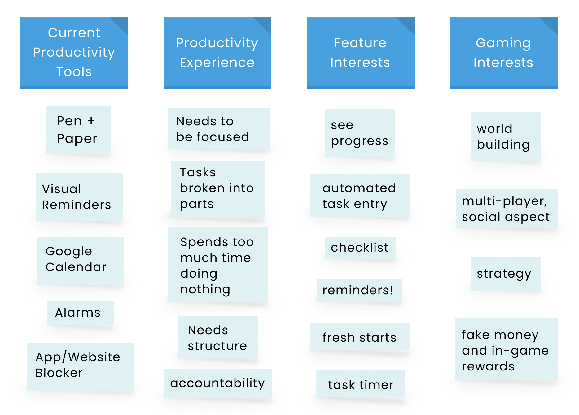
100% confused by the use of plus signs
62% could not figure out how to enter task notes
25 % couldn’t find the add a task button
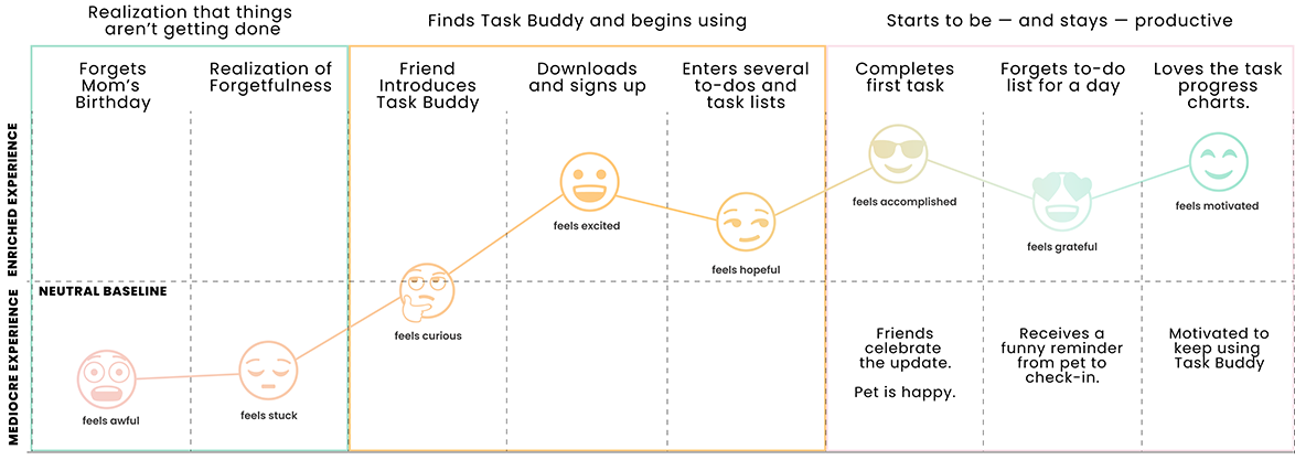
Our users were helpful in showing us potential issues with the format of our prototype and gave us a better insight as to how the app might be used. We were able to learn
more about the order of how tasks are intuitively created by users and what features might be preferred by them.
Conclusion: We needed to focus on the navigation structure. Make sure that the symbols and button placement are what and where users expect it.
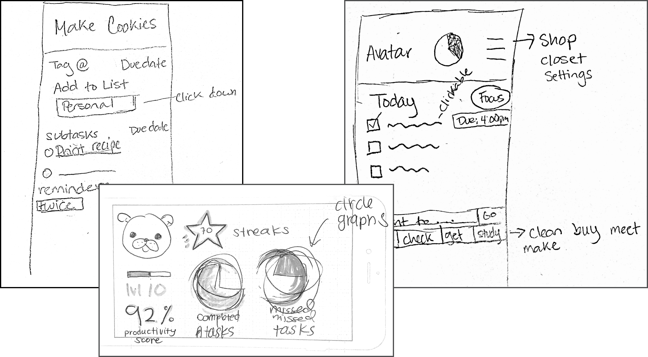
Iteration of the Prototype
When it came to the next iteration, it was clear that we needed to rethink the information architecture. We studied the interfaces of our competitors again for more insight into good UI patterns.
I brought in a some graphic elements to get an idea of our user’s preferences with the next round of testing. We incorporated blue icons and text for our calls to action, breadcrumbs, and labeling.
Not exactly a low-fidelity version, but good to start building our tone of voice.
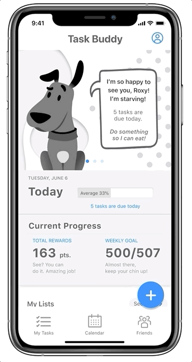
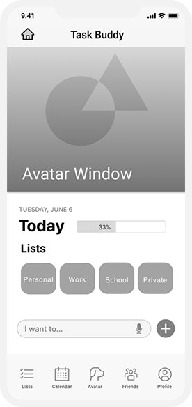
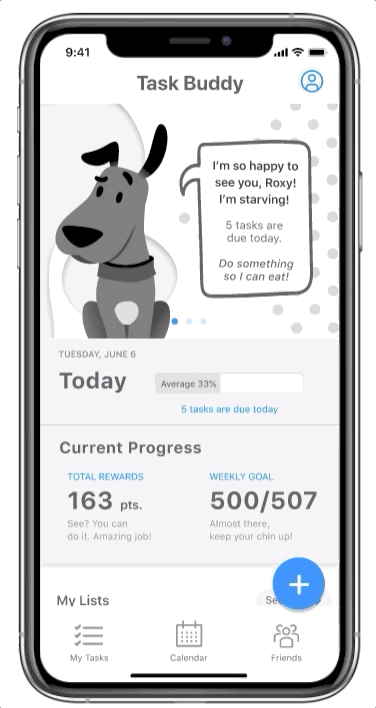
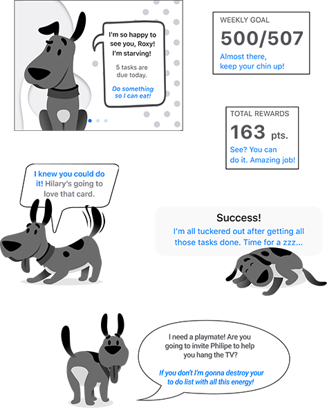
I updated the avatar area to a flat illustration of a dog to tie into contemporary aesthetics. I included speech bubbles to enhance the feeling of the pet’s interaction with the user and create an emotional connection..
I enhanced the stats and added words of encouragement on today’s dashboard. The avatar area is now a carousel that includes a leaderboard for streaks and productivity scores.
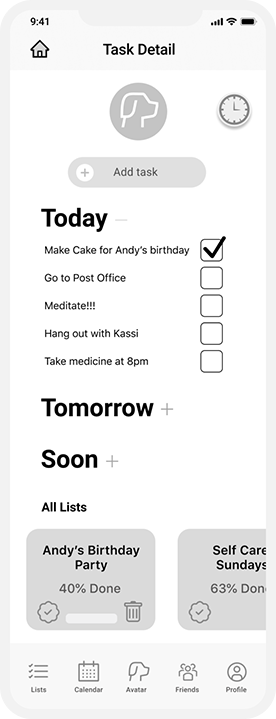
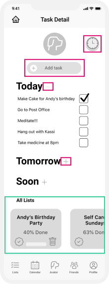
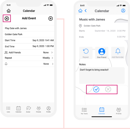
We replaced a “Add a Task” field with a floating button. We decided to continue the same button styling throughout the rest of the application.
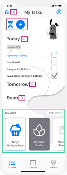
We simplified the bottom navigation and moved the profile to the top right, to tap into user’s muscle memory from other apps.
 I know this isn’t a typical low fidelity prototype, but I wanted to get an idea of user’s graphics preferences with this iteration. Will we pay for it? Yes, the answer is yes.
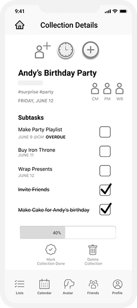
We changed the plus and minus signs as an accordion signifier to a more universally recognized caret signifier.
We changed icons for the timer and add task button and added a back button.
I updated the list section to include a card with icon for each list. I removed the data used on each list cover, as well as the complete and delete icons. These sections were too small for people’s fingers to reach accurately.
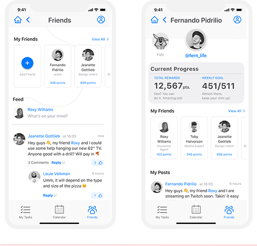
We added a social experience with a friends list, profile page, and news feed for sharing updates. We did this is to naturally build in motivation and accountability to the app.
We changed the plus sign, which indicated add event, to a checkmark to reduce confusion on the icon’s meaning. We also moved them to the bottom of the event details as it is a natural placement of a final confirmation.
Buddy's Tone of Voice!
It is important that the user feels like Buddy is on their side, so I wanted the copy to be short and snappy, edging sarcastic yet oddly motivating. This is rolled into all of the in-app messaging and reminders.
Testing, Round 2
Objective: Are people able to tell the purpose of this app? Is the user able to quickly find how to add an task? Do the dog interactions make sense? What about the social feed?
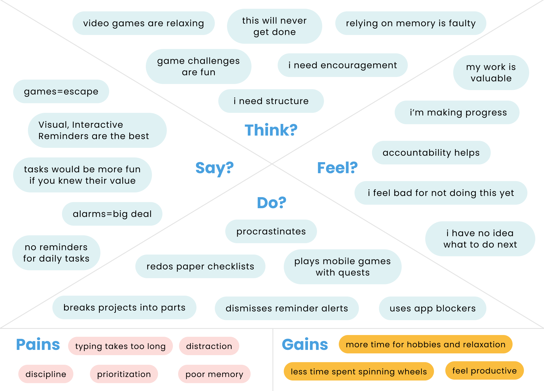
Only 50% of our testers were able to determine what the app is for via a 5 second test.

25% didn’t want a calendar to create events.

100% wanted more interaction with Buddy and a world for him to live in.
I tested 5 people on this Version 2.0 protoype and one thing was clear. The idea is good, but the current execution needs more work. We should have spent more time developing the
Tamagotchi effect and perfecting the user flow. Users were confused that the add button was not in the same place for each section, and also did not find it’s placement ideal.
Several users were confused by the calendar section, as it didn’t display each day’s to-dos and they did not want another app for managing events. In some ways, the results were
about the same as Version 1.0. At least testing is easy!
“I’d like to see a world for Buddy to explore and an environment for him to live in that I can make pretty. Does he get sad when I don’t get things done?!” —Kelly Cloar, User Testing
Conclusion: Content is king. We should build out Buddy’s world. Spend more time thinking through information architecture, UI patterns, and less time making the interface attractive in a lofi prototype.